TAGISU.COM
send your images to submit@tagisu.com
submitted by steve block // view full size
| joshua m. haroldson | brick-tastic. |
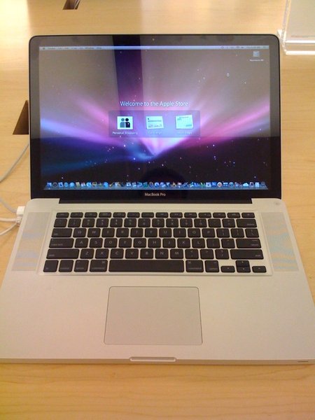
| andy buck | i'm not sure if i can get into this new design. the black bezel just doesn't make any sense. |
| andy buck | macbook pro more like HP pavilion dv6000 |
| ben janke | what andy really means is CONGRATS ON YOUR NEW MAC. and get rid of that ugly dock, pronto ;) |
| joshua m. haroldson | i love the second comment on the flickr link. |
| andy buck | steve clearly did not buy this |
| steve block | ben kind of an idiot |
| andy buck | true |
| andy buck | does it feel more solid? |
| sam wong | more like toshiba satellite pro |
| steve block | it feels quite a bit more solid, and the lines are nice. i am also a fan of the battery door on the bottom |
| ben janke | it was wishful thinking, i guess. i didn't actually look at the picture i just read comments now. |
| victoria jones | I'm with Andy on this... the black really doesn't work for my tastes. Although, I'm not in the market for a laptop either, so it doesn't really matter. |
| jenn wendell | I want a new mac soon (like within a year). And I agree with both Victoria and (ghasp!) Andy that the black keys aren't doing it. What happened to streamlining shit? |
| joshua m. haroldson | the black keys are bothering me more and more every time i look at that picture. |
| andy buck | i have not seen it in person yet, i need to before i really figure this out. |
| victoria jones | Yes, the contrast bugs me too. Maybe if they'd made the entire top of the keyboard panel black... but then it'd just be a black Macbook. |
| steve block | the look of base section reminds me of the tibook actually, only a lot sturdier, and the top reminds me of the new imac, so overall i call it a win |
| victoria jones | Steve, I think you're assessment is right, I just don't like the mesh of the two aesthetics. |
| jonathan rahmani | i like it. Def a fan. it's streamlined in the details. clean lines, sharp edges. if dropped it feels as though it would dent the floor not the other way around. Personally I prefer the macbook over the pro. maybe because the black keys and the black screen are closer to the same total width. |
| sam wong | i played with one the same day, and i can say it's the best mac notebooks ever. . when closed. =\ |
| andy buck | i could tolerate the keyboard as a throwback to the original powerbook g4 |
| andy buck | oops ^ |
| mark jacobson | yuck - almost all apple products are greater than the sum of their components, definitely not in this case |
| shea prueger | i really need a new computer, but i can't deal with the black and white. kind of gross. i just don't understand what they are thinking - apple is always right on. |
| jonathan rahmani | hey shea --> computer |
| andy buck | she already has an aging 15", no need for an aging 17" |
| jonathan rahmani | you're aging. |
| victoria jones | Saw Michael's in person, I take it all back, the machine is hot. |
