TAGISU.COM
send your images to submit@tagisu.com
submitted by jonathan rahmani // view full size
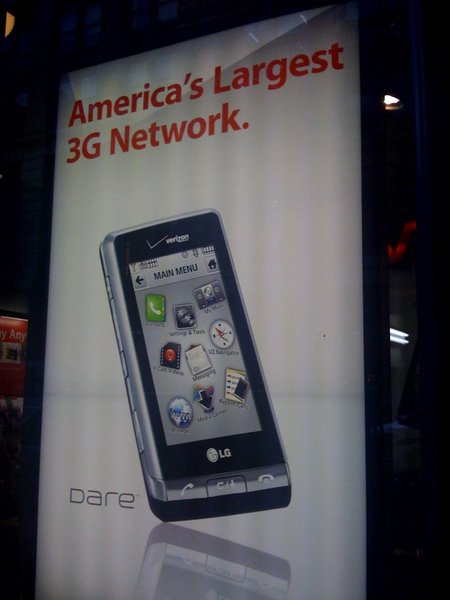
| joshua m. haroldson | nice phone. i much prefer the black theme though. |
| jonathan rahmani | oh...i was wanting to point out the sillyness of icons tossed all willy nilly round such a small screen. |
| andy buck | yeah seriously, what the fuck is up with that icon layout |
| joshua m. haroldson | no i totally agree. the point of the white theme is that you can rearrange the icons how you want, but no matter what they are always crooked. its a total mess. that's why i use black |
| shea prueger | oh my god. that icon layout makes me want to throw up. i'm not reacting to that in a positive way AT ALL. andy, remind me never to buy anything LG. can't support people who make these kind of decisions. |
| joshua m. haroldson | i have this phone and beside this one menu screen (which you don't ever have to use or see) it really is a pretty solid phone. don't judge the rest of this phone by its shitastic cover! |
| steve block | josh, since that is the ad they are using, they clearly want us to do exactly that |
| joshua m. haroldson | i know. bastards. |
| shea prueger | i'm totally judging it by it's cover because it makes me physically sick. i'm sure that if i was all about getting a new phone (i don't even have a real phone as of right now) i would choose something that didn't give me hot flashes of disgust. |
| andy buck | i am so glad there is someone else who felt sick after seeing this. |
| jonathan rahmani | Yes! 'Tag-talk' points for me! |
| joshua m. haroldson | all i know is i wasn't switching to at&t or paying $500 to jailbreak an iphone and still have to switch to t-mobile. plus, i haven't even seen that disgusting piece of design since about 2 seconds after i bought the phone and permanently changed the theme. |
